SweepTrack — from idea to a shipped field product
You're in a field, one hand on the detector, gloves on, maybe after dark. Every screen had to work under those conditions.
- Sector
- Consumer Android · Metal detecting
- Role
- Product concept, brand identity, interface design, design direction
- Period
- 2026 — Present
- Disciplines
- Product direction · Brand identity · UI design · Visual system · Android

One line traces the shaft and coil of a detector and resolves into an S. It had to survive being an app icon first — so it was drawn at 48px and grown from there.
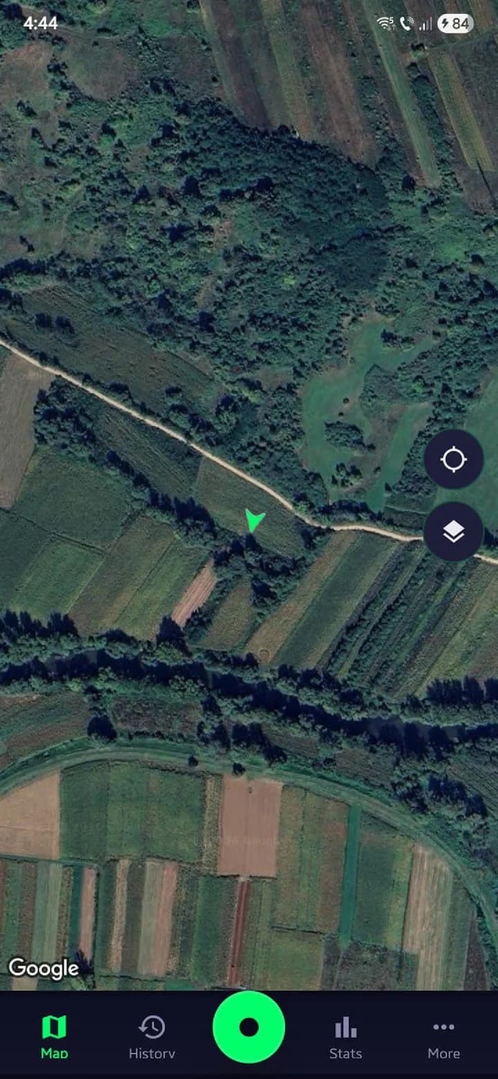
Map — live session, satellite base layer
Context
SweepTrack is an Android app for metal detecting. It records where you walked, pins your finds to the track, and keeps sessions, maps and stats in one place.
It's my own product — concept, name, mark, interface, and design direction through to the Play Store.
The design decisions come from the field. Screens get read at arm's length in daylight and after dark, so the interface is dark-first, the main controls sit under the thumb, and there's a red night-vision mode for when your eyes have adjusted to the dark and you'd like to keep it that way.
SweepTrack-RO came after — the same identity and system, adapted for the Romanian market.
Interface
Built to be read outdoors, at arm's length.
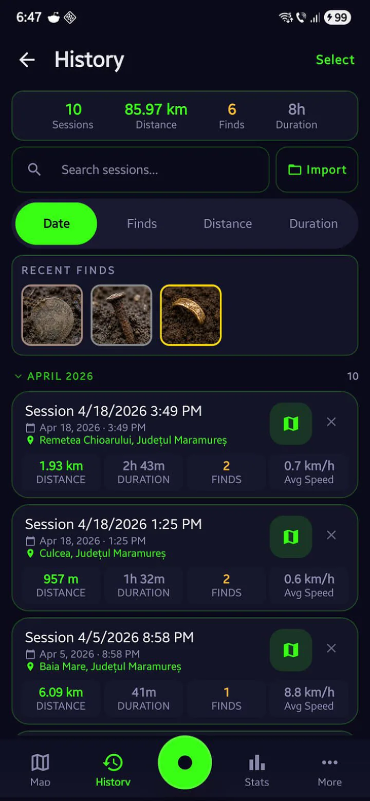
History — sessions, finds and totals
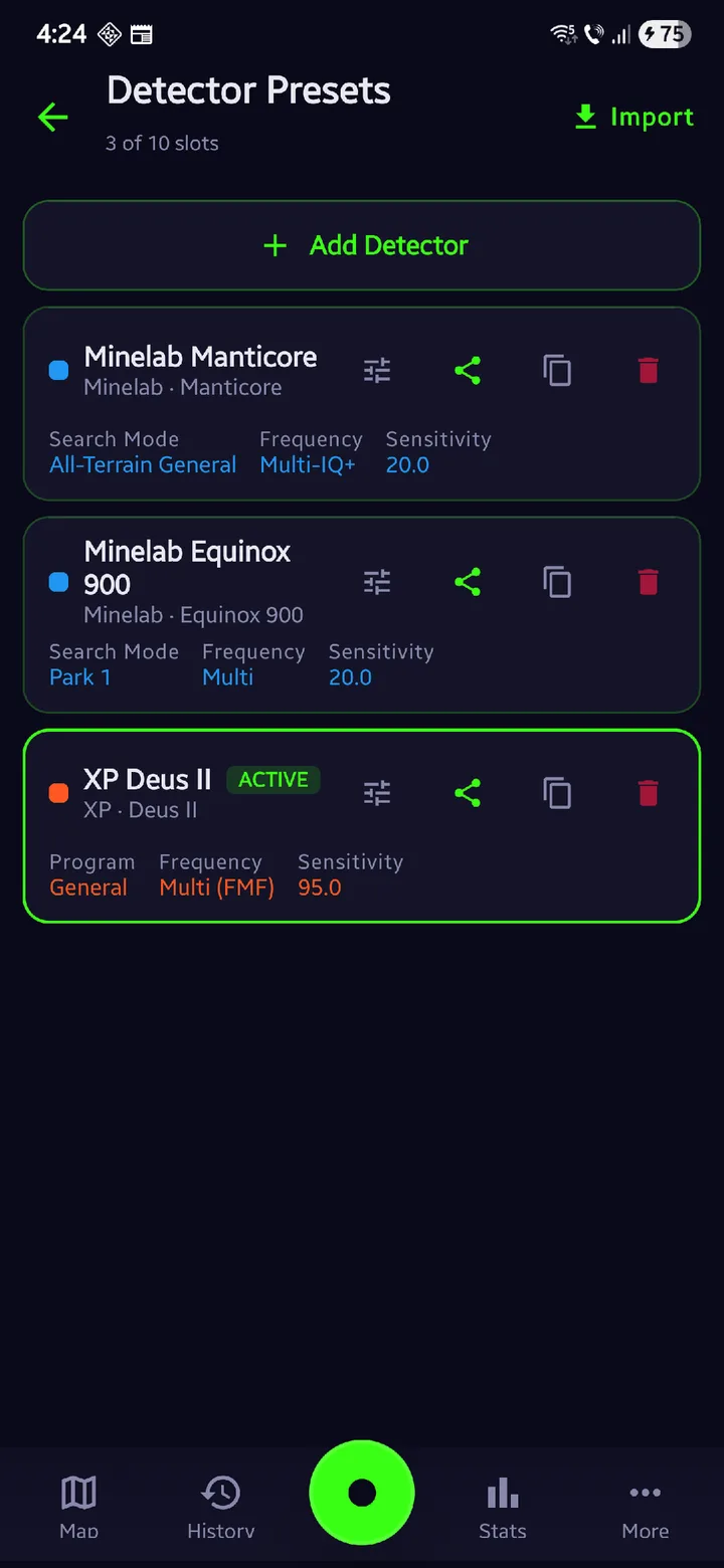
Detector presets — saved machine configurations
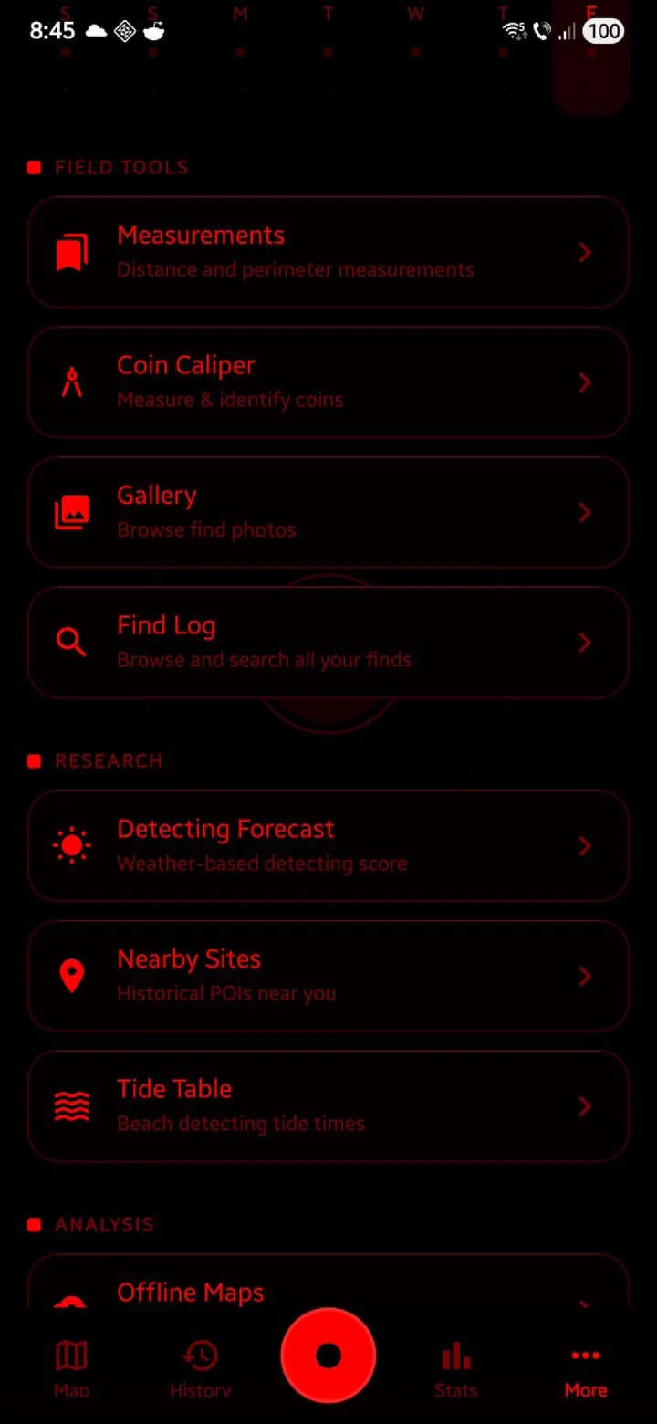
Night vision — red on black, to protect dark adaptation
System
Three decisions the rest of the product hangs on.
- Typeface
Inter for interface, Space Grotesk for display, JetBrains Mono for numerics
Numbers get read at a glance mid-session, so they get a monospaced face and their own hierarchy.
- Colour
#00FF6A on near-black, plus nine selectable palettes
One green carries the brand. The other palettes are the user's to pick.
- Structure
Persistent bottom navigation with the record control at centre
A session can be started and stopped one-handed without looking away from the ground.
Identity in application
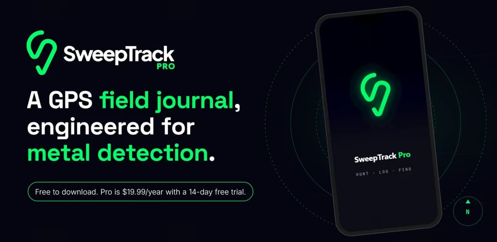


Role and outcome
Responsibilities
- Product concept and feature definition
- Brand identity — mark, wordmark, app icon
- Visual system — palette, typography, iconography
- Interface design across map, session, history and settings
- Design direction through implementation and release
- Store and launch assets — feature graphic, social templates
Outcome
- Two applications published on Google Play — SweepTrack and SweepTrack-RO.
- Product site live at sweeptrack.pro.
- One identity and one interface system running across both editions.